

Incoming Business Administration & Design student at Northeastern from Jersey. Below are some of my projects that I've done throughout highschool.
(Mar. 2024 - May 2024)
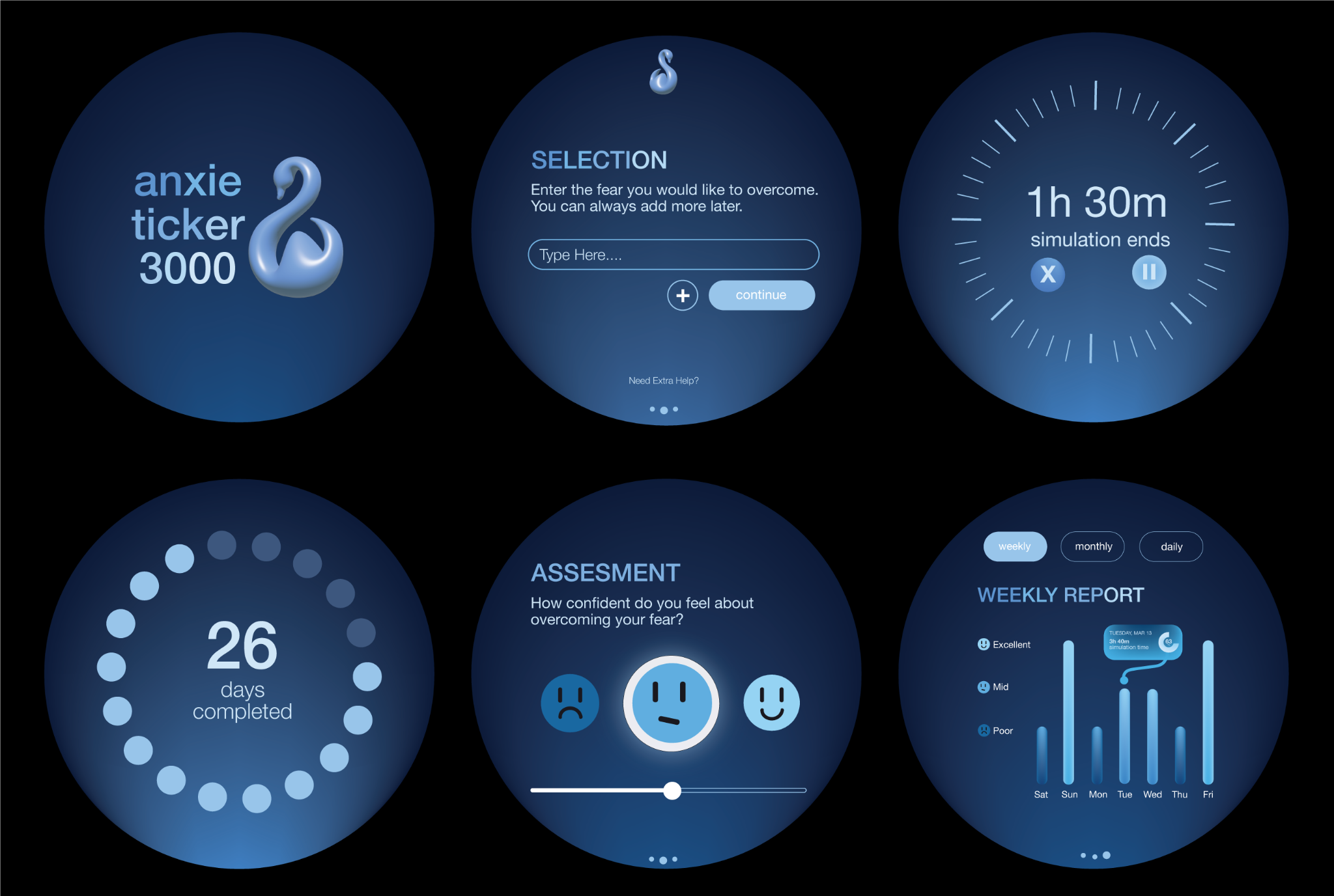
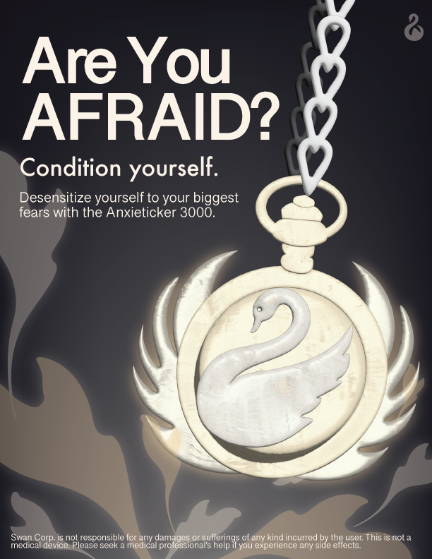
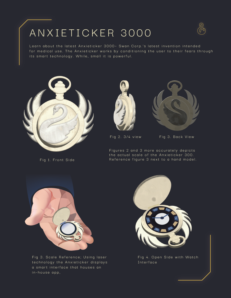
Developed and designed an invention, the "Anxieticker 3000." This invention is shaped and functions like a pocketwatch, with extra additions to solve the problem of fear.
(Nov. 2023)
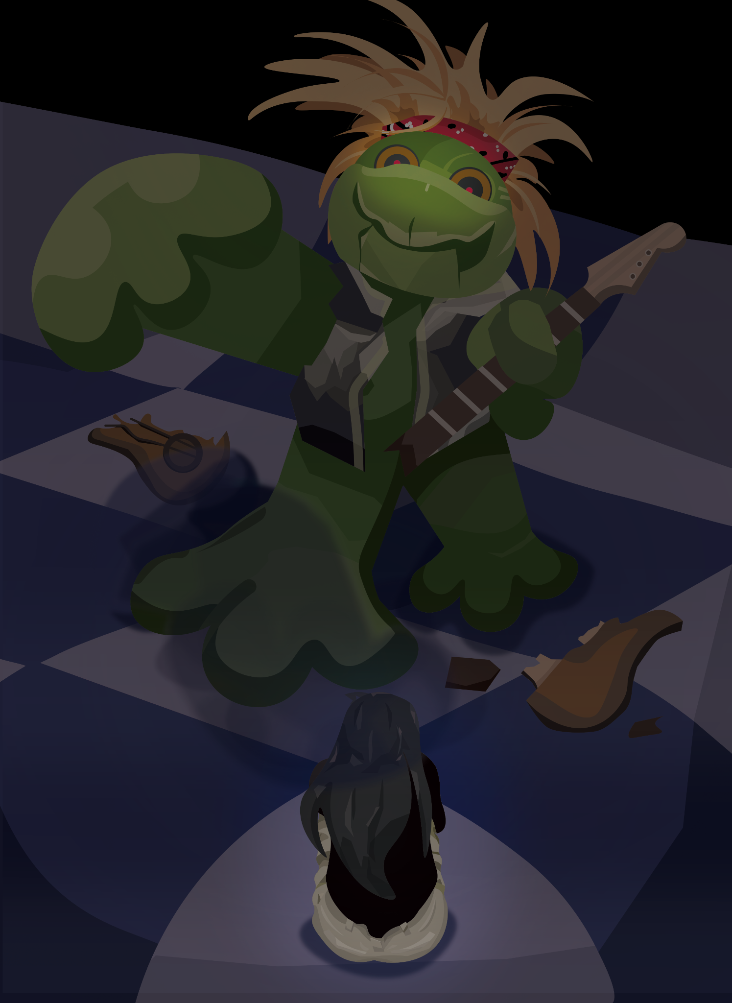
My sustained investigation explores the question, "how has personal failure and fear shaped my outlook and world view?" In this piece, I decided to tackle an early childhood fear- a singing frog plushie I had as a child. I purposefully exaggerated the toys features, making it appear bigger compared to me.
(Dec. 2022 - Apr. 2023)
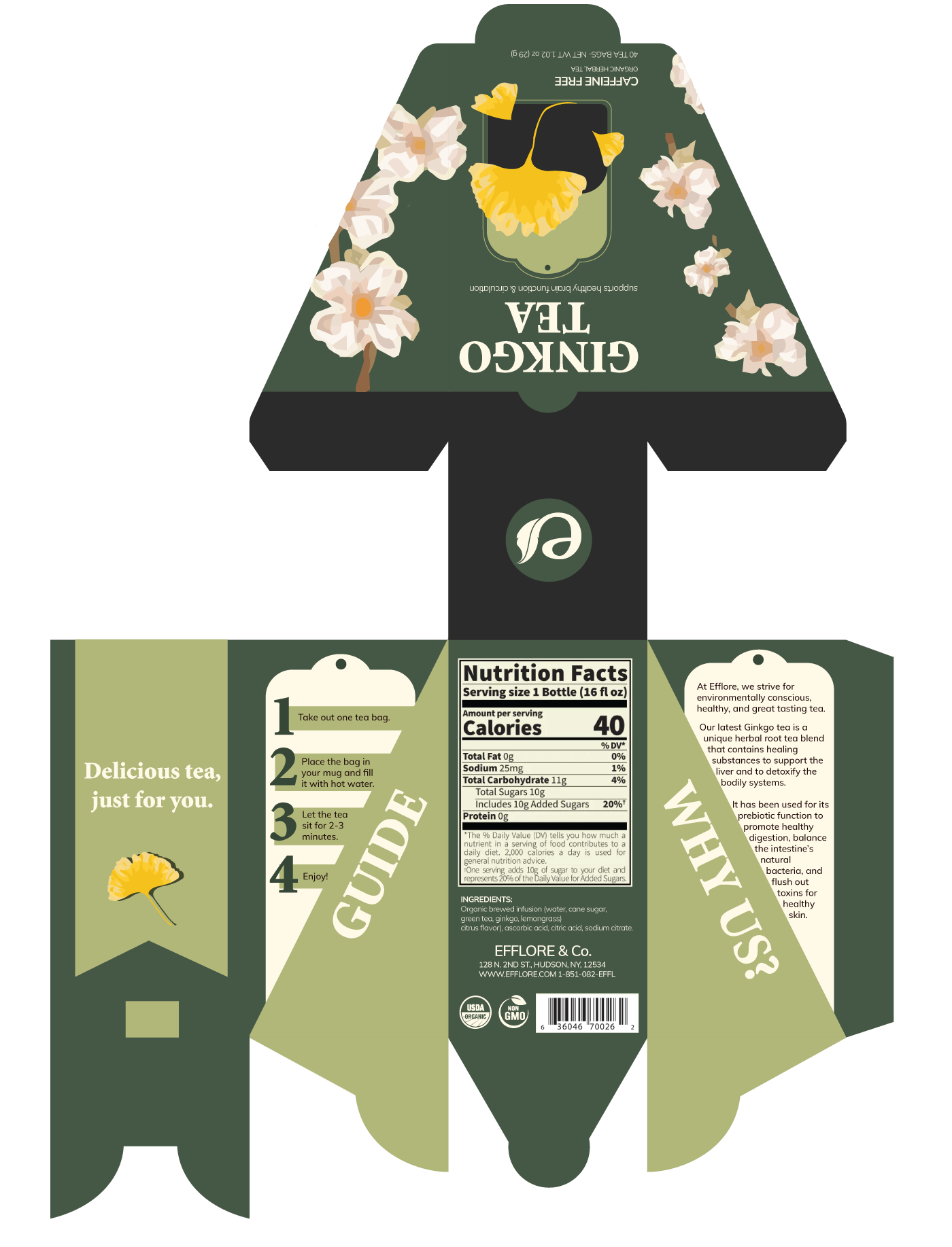
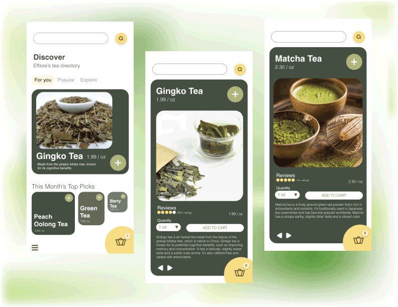
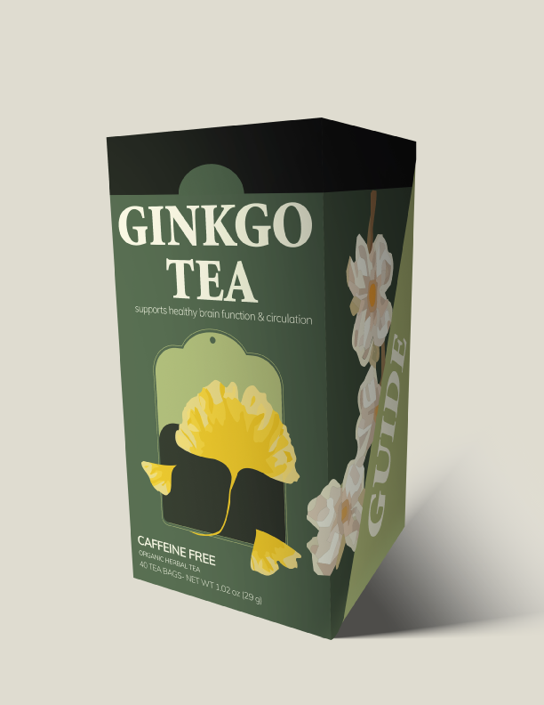
A fictional tea company that caters to young adults. It focuses on promoting a healthy lifestyle through the variety of teas that is offered. Efflore is short for ‘efflorescence,’ which means the process of developing and unfolding as a flower. Green was chosen as Efflore’s dominate color as represents growth and the connection with the earth.
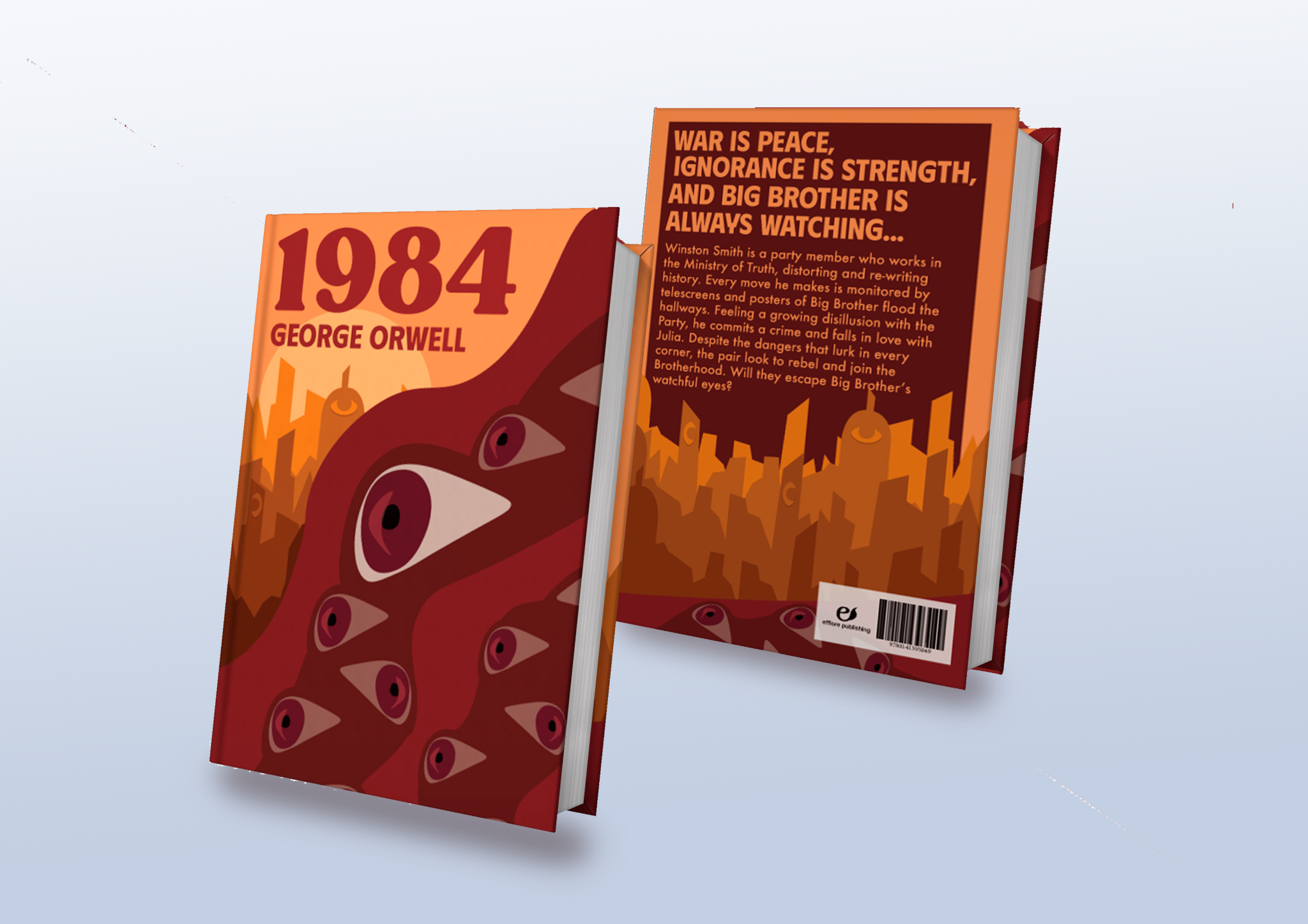
(Dec. 2022) *A mockup template was used to display the covers.
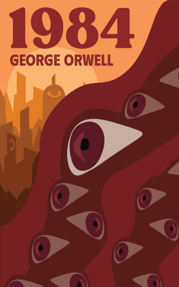
My design for the book, 1984 by George Orwell. I chose a bright, bold color pallette consisting of yellow and red as a nod to the themes of Communism throughout the book, and because other designs featured a very dark (black and red) color pallette. Throughout the story, 'The Party' has its propoganda plastered everywhere for each citizen to see, and I wanted to highlight that through the use of brighter and eye-catching colors.
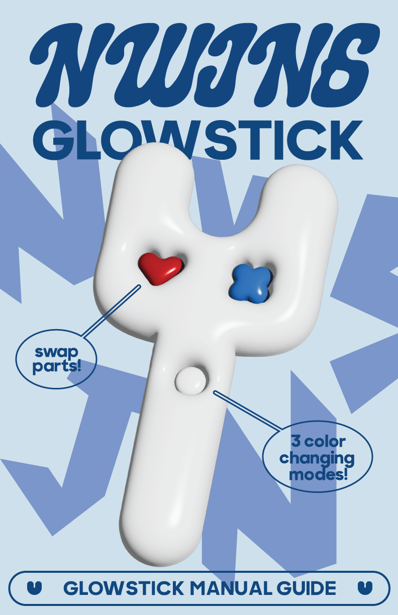
(Aug. 2023)
Concept user guide for girl group, 'NewJeans' for their glowstick. Experimented using Illustrator's 3D function to create the glowstick.
(Oct. 2022 - Nov. 2022)
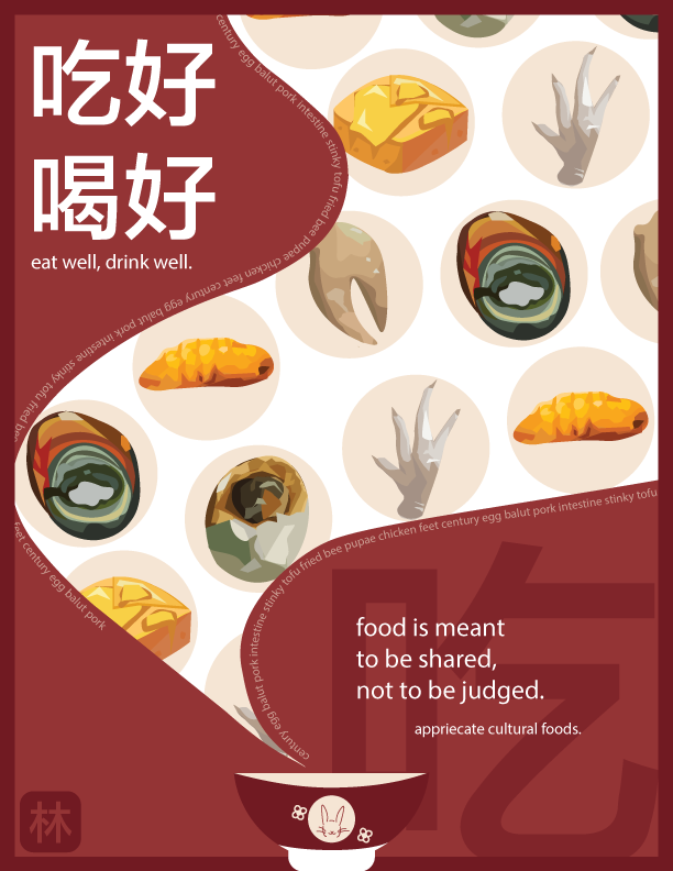
Contest held by the New Jersey Police Department for the 3rd Annual Youth Bias
Competition. The theme was to create artwork that stood up to bias against a
certain group.
I decided to focus on Chinese cultural food because it is such a big part of my life. Specifically, I focused on food that is not conventional according to Western standards. On social media, people voice their opinions on odd cultural foods and they automatically shunned and frowned upon. I chose to highlight some of those foods with the message being not to judge cultural foods.
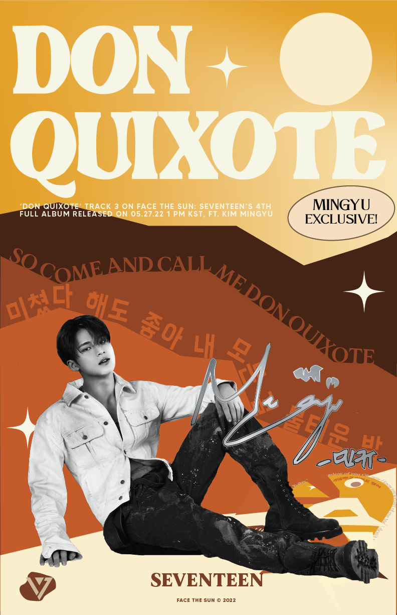
(Jul. 2022 - Aug. 2022) *All photographs and textures used are not mine.
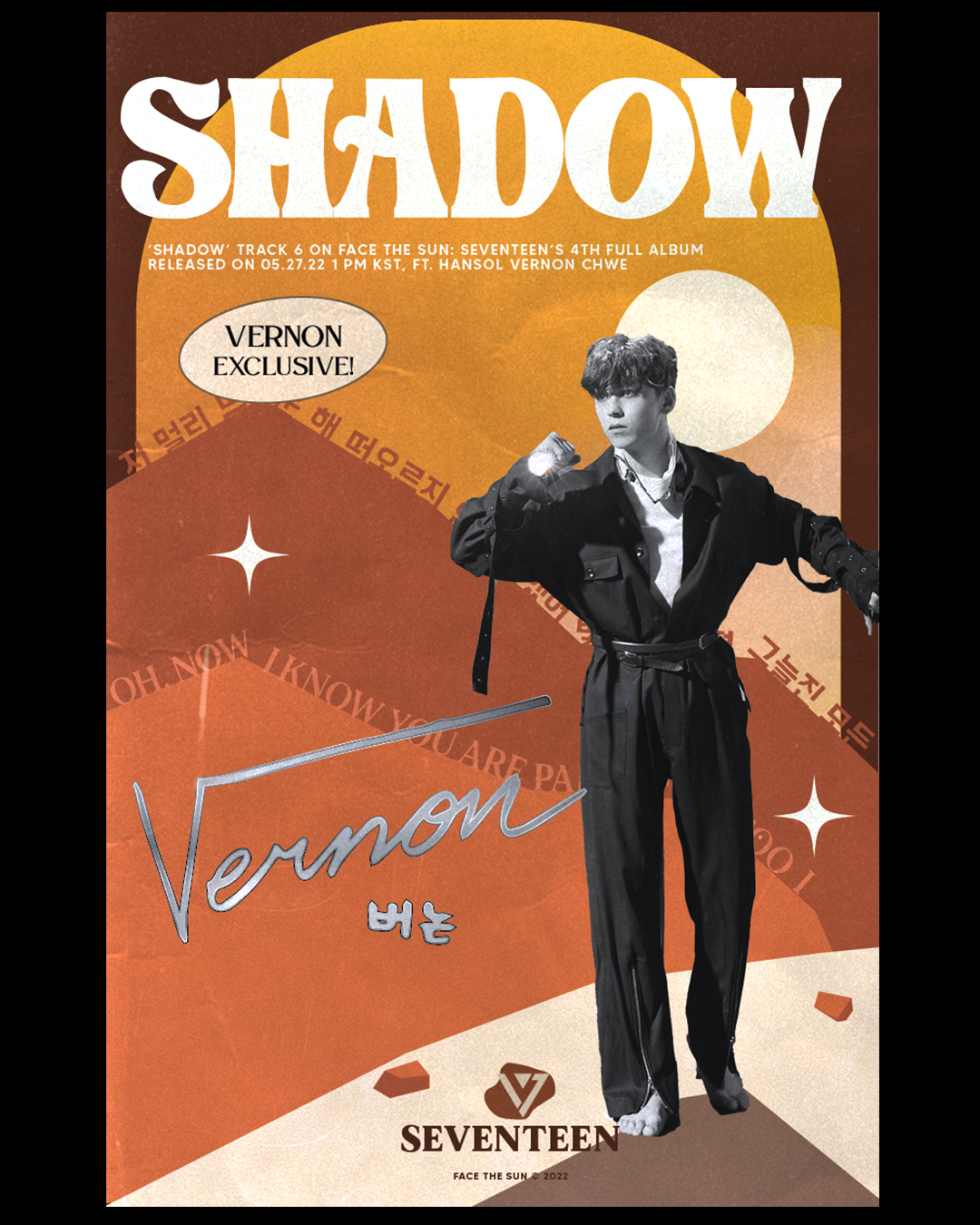
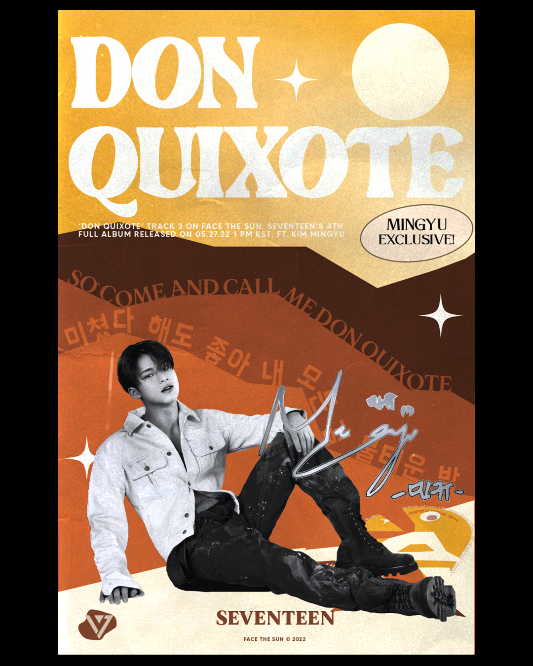
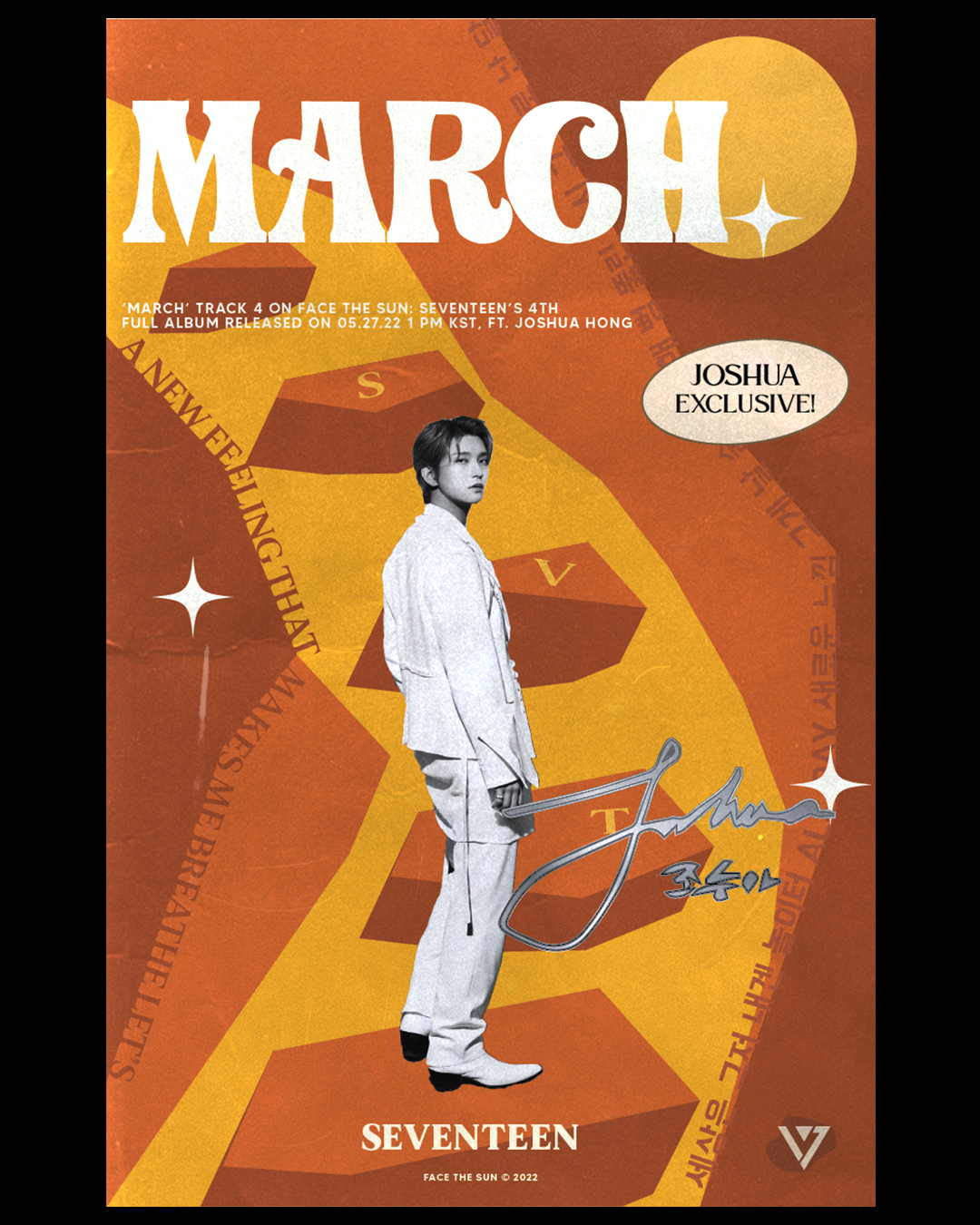
A three part music poster series for the boy band, SEVENTEEN. Each piece features a different song and a different member from their album, "Face The Sun." Each poster has elements that are prominent throughout the series through the use of fonts, graphics, and colors. I wanted the setting of the posters to give viewers a sense of stillness, isolation, and to mimic a desert setting. To achieve this, I made the subject of each poster black and white. They automatically draw the user's eye when contrasted with the other colors of the poster. The dominate colors of red, orange, and yellow are used to encapsulate the artists’ vision for their album, but also to encapsulate the feeling and energy from their songs.
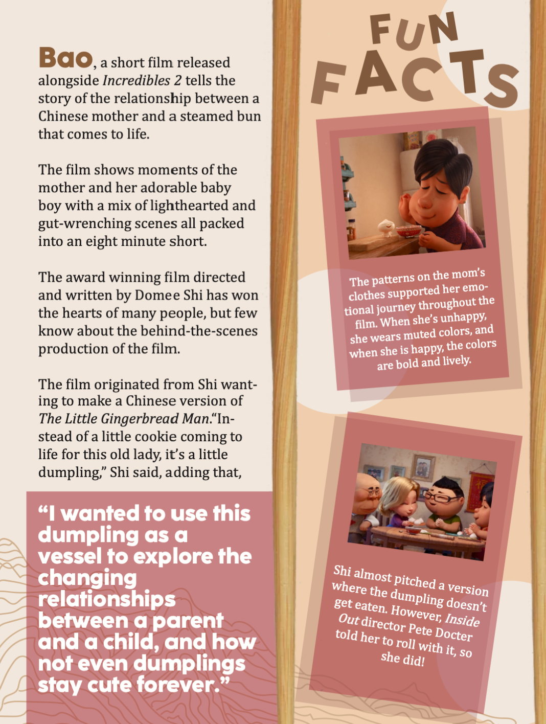
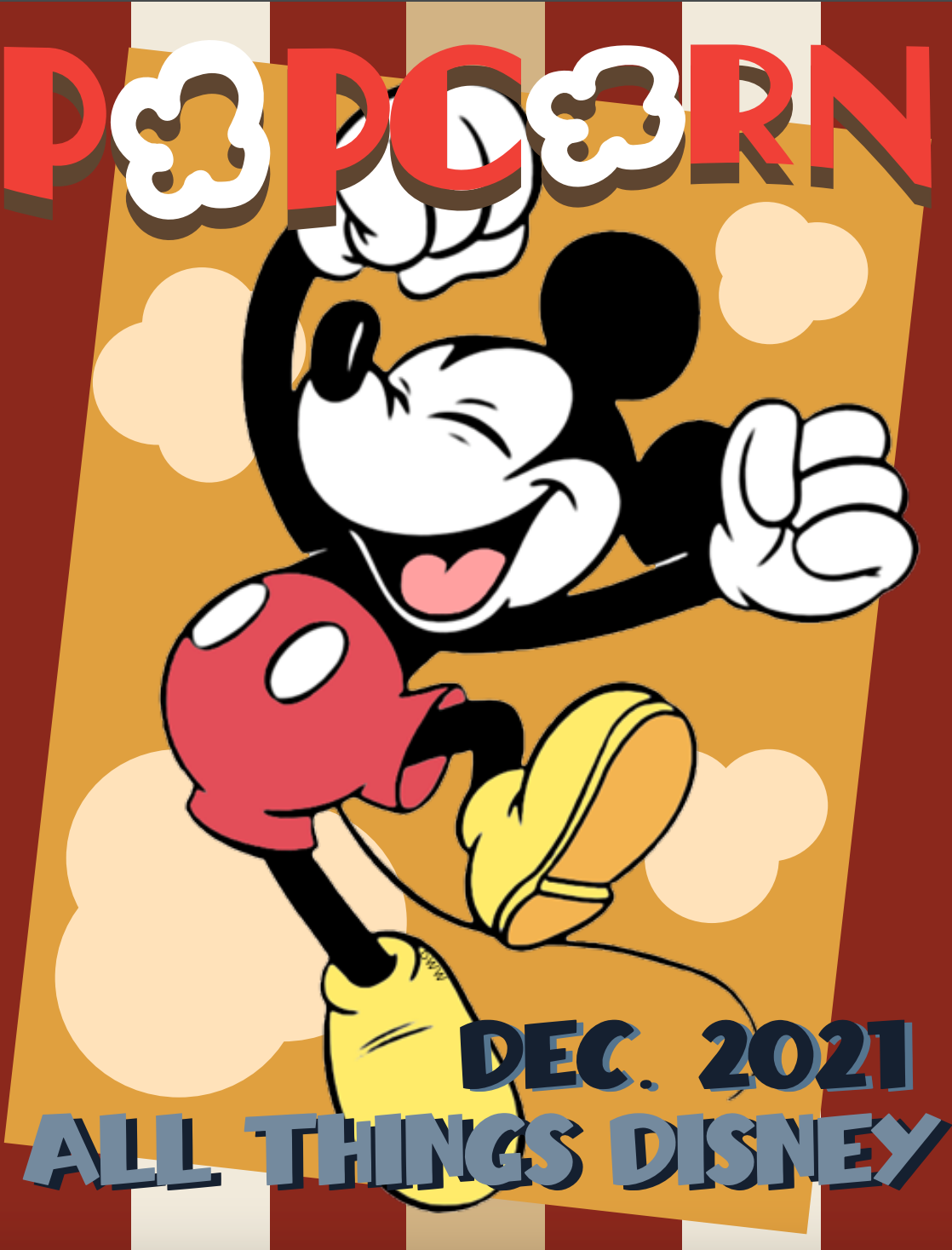
(Dec. 2021 - Jan. 2022) *All photographs used are not mine.
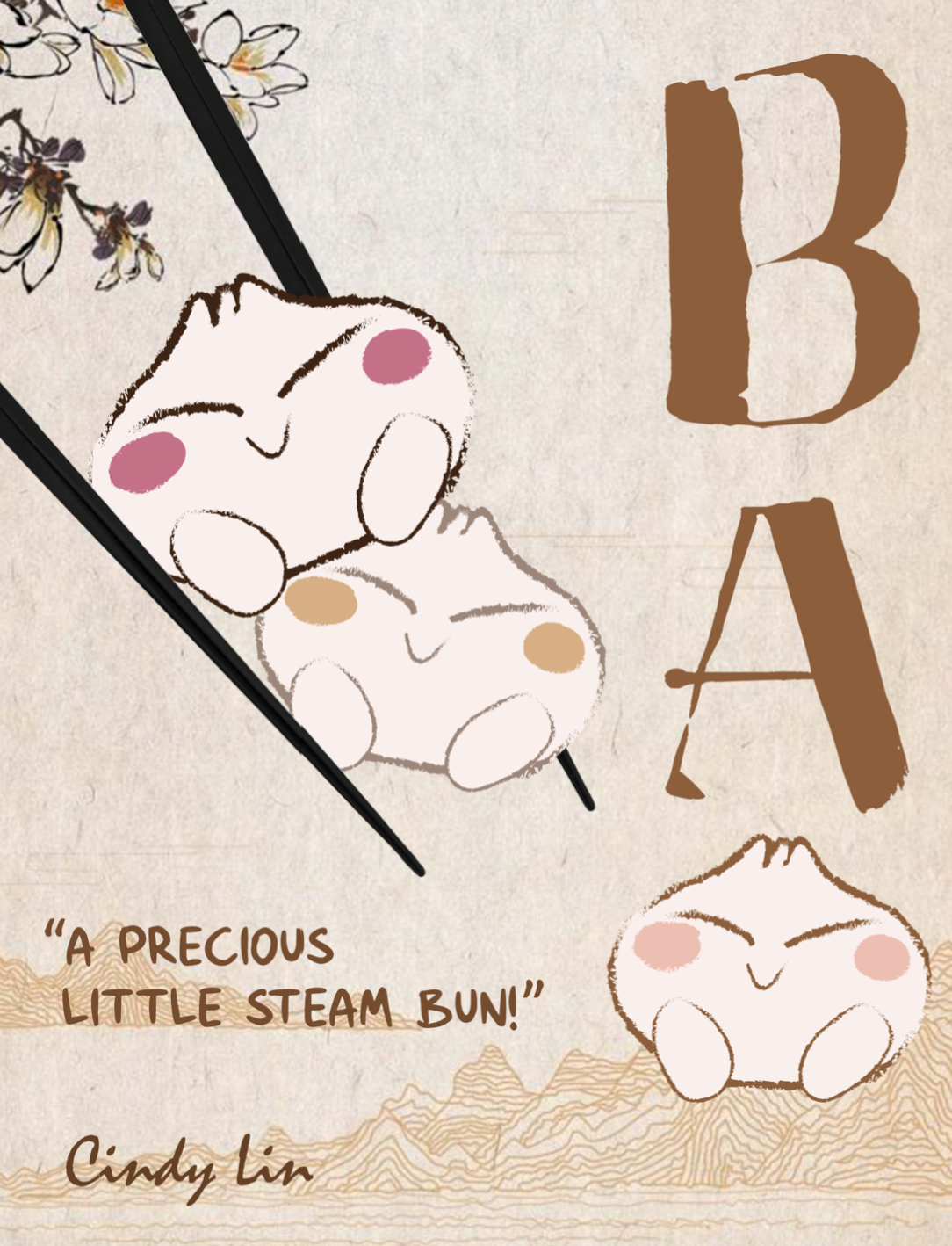
Layout for an article written by me on the Pixar short, Bao. As a group of four, my classmates and I collaborated together on a e-magazine called, 'Popcorn.' Each member was assigned to write, create, and layout their own articles.
I drew the steam buns that appear throughout the piece, and used an accent color of pink, as a close shade to red, to symbolize the lucky color of China.
I also created the cover for the magazine. Mickey Mouse was used as the center graphic because of our issue theme, and the "o" in popcorn is replaced with kernels.